Festival Poster

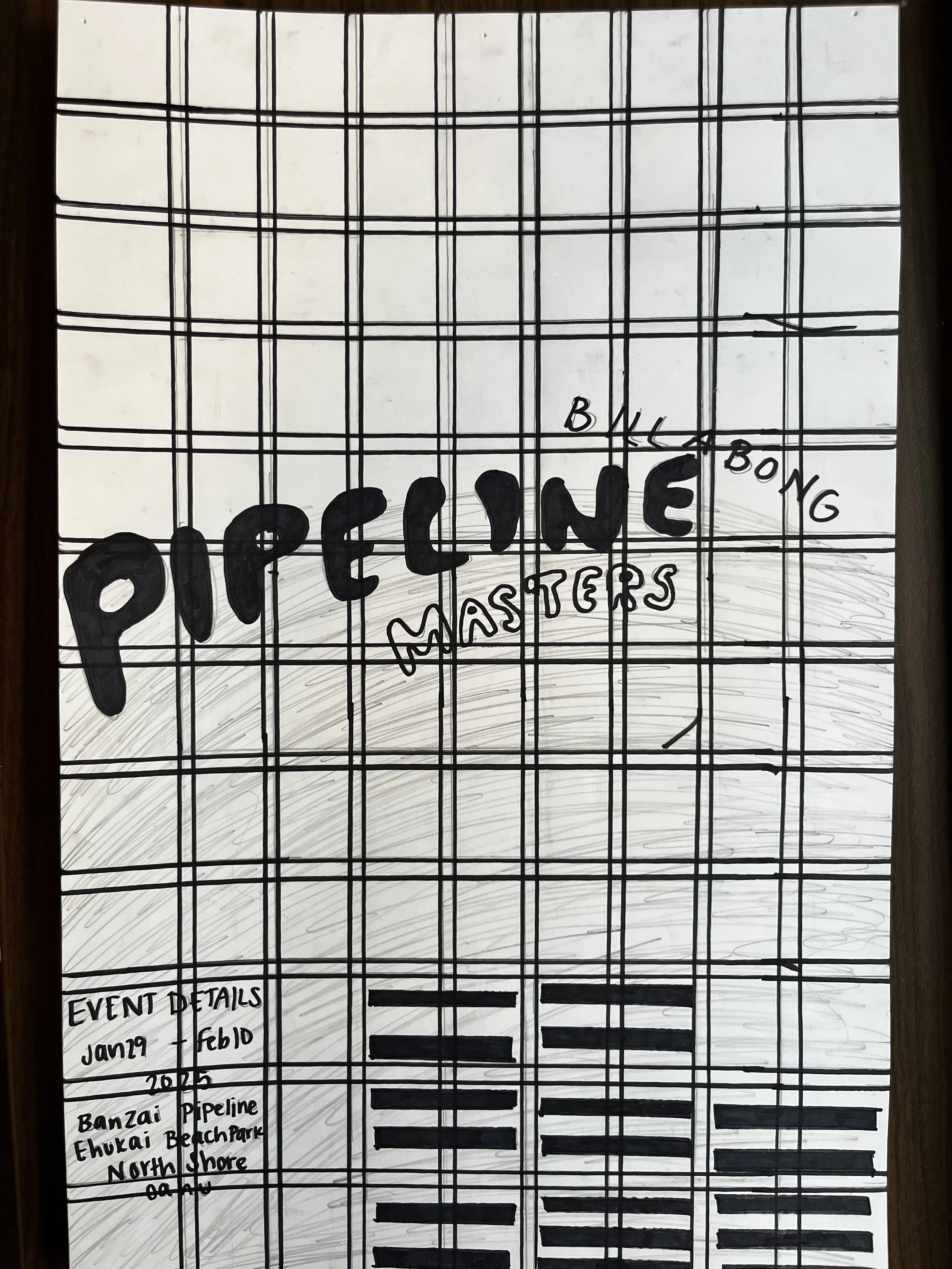
The Festival Poster project challenges design to think beyond images, but understanding how we can visually communicate our audience setting typography as the primary element. Having typography as the primary element, designs needed to be able to use hierarchy effectively so it could guide the audience and evoke emotion. The goal was to communicate the experience of the festival to the audience effectively. Successfully presenting techniques such as hierarchy, color, scale, and grid use, were important factors into creating a strong final product. The challenge was exploring how typography can capture the concept of the festival and allow the text to become the artwork.
Original

Updated

For this process exploring different typefaces was a crucial component in the sense that it would fit in with the research surrounding the festival. As the designs focus was on the text and how it was able to be manipulated having successful typeface mattered. I struggled with finding a grid layout that focused on the type manipulation but also the placing of the surrounding content of the festival. After many tries of placing the extra details all around the poster, the most successful position was at the bottom. This final poster layout guides the audiences eye to run from top to bottom.


Progress Work