Menu Design

This project was a re-introduction to hierarchy and typographic designs that focused on how form could display content effectively. As designers we used alignment, hierarchy, and the grid systems. The challenge was displaying a grid system while still exploring creative typographic elements. It was also a lesson of understanding white space and that it can be successful in design.
Menu 2

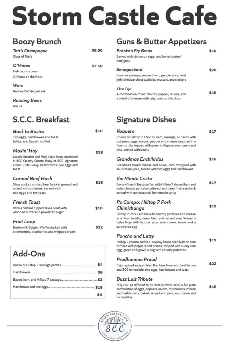
This project challenged us as designers to rethink the grid layouts of a menu. This project taught me that geometric elements aren’t alway necessary in a design, whereas, hierarchy and balance of typeface combinations, have greater effects. Many explorations were made to align everything to a grid system, and establish hierarchy. An attempted challenge for this typographic display was rotating text vertically and allowing there to be white space. A takeaway was exploring levels of white space, understanding that white space can be successfully used in certain circumstances.
Menu 1


