Bitmap Monogram
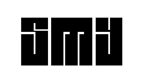
The Bitmap monogram project was an exploration into typography design. Using the initials S, M, and Y, the focus of this project consisted of simplicity, structure, and cohesion across the three letters. Achieving cohesion brought challenges regarding the M. The S and the Y were able to display consistency, but the M seemed to be a road block in that path . The struggle was the spaces in the M not aligning with the spaces in the S and Y disrupting the balance. A solution to this challenge was attempting to meet the M Breaks with the breaks present in the S and Y. Through this progression a more consistent bitmap was created as the M has become more consistent with the other letters.

Original
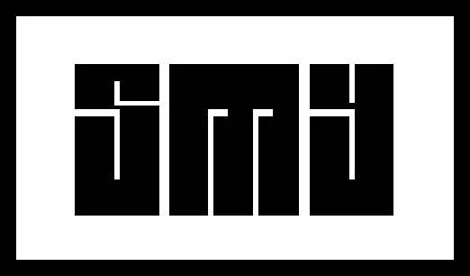
Updated
This was an exploration of form, using a pixelated grid system to create cohesive forms. This process displays how small, strategic changes can have a great impact on the final production of a design. Through these small adjustments to line weight and spacing, a more cohesive aligned piece was able to be displayed. The final monogram is bold and consistent throughout the letters.
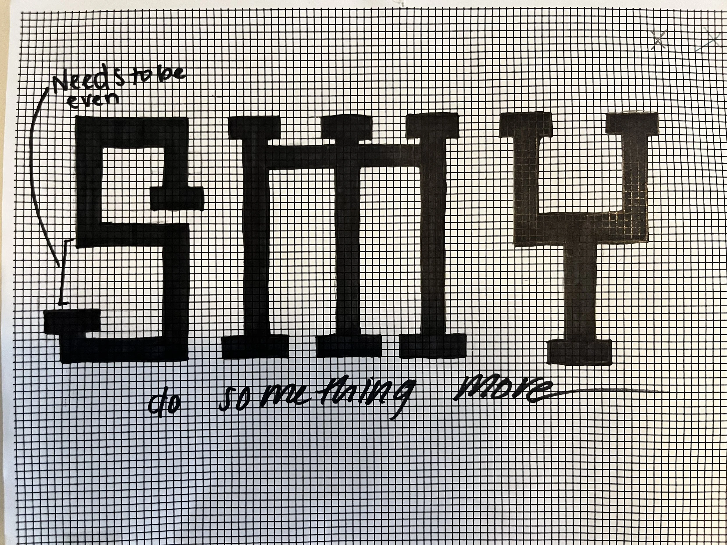
Process Work


